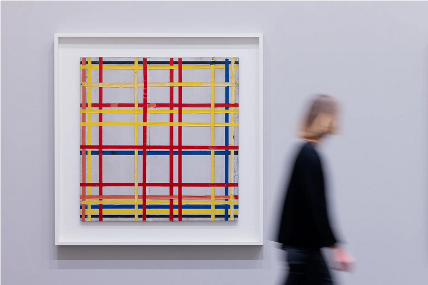
Last week, I read an article about something that nobody cares about. It has been proven that a painting of Mondrian (New York City I) has been attached the wrong way to the wall of the gallery for 77 years. One of the curators discovered this grotesque error by comparing it to its back-then photography. In fact, the real painting should be hung upside-down. This anecdote raises profound aesthetic issues. I listed three of them.
First, of course, one can wonder how this artwork could have been displayed for so long while nobody noticed the mistake. By no means would such a mistake have been possible with a figurative painting. However, modern art is another story. It profoundly redefined the figurative feature of painting, rethinking the very gesture of painting, not only about its technique but also about the shape and space it conveys. With the paradigm of modern art in mind, maybe some eminent critics jubilated around New York City I claiming its impeccable lines divide the white canvas soundly and structurally. Maybe experts of Mondrian considered this parting without being critical about it and assumed it was in perfect continuity with former works of Mondrian. And maybe many educated visitors took an inspiring posture when admiring the painting and the genius of its creator. Facing this irony, we are entitled to wonder whether modern art (and, potentially, contemporary art) does care that much about the plastic quality of works, or whether modern art is just a matter of mundanity and pedantry without artistic meaning. It reminds me of a contemporary art exhibition exhibiting a pineapple on a table. This pineapple was actually brought and laid there on purpose by a malicious visitor. No other visitors noticed the hoax for several days. They were even taking pictures of the fruit. This little story demonstrates that visitors are prone to accepting any artefact as art insofar it is presented as such (i.e., in a museum). Ironically enough, the performativity of museum display is precisely the trait that differentiates modern art from contemporary art. Due to this mistake, Modrian is more contemporary than ever.
This last consideration echoes the second point I want to address. Although curators committed a funny mistake, they are all but stupid. The current curator of the exhibition explains the rationale behind this long mistake. Her predecessors chose the display the work in this direction in order to match with the sense of Mondrian’s signature drawn behind the canvas. They chose to guide their aesthetic intuition with the artist’s signature. Signature comes first, meaning and aesthetic experience come after. Since the Renaissance and the emergence of subjectivity, painters have been signing their works. This signature is not just a means of recognition but also an artistic gesture per se. Signing makes art exist. Signing is performative. Signing attests that the object you are seeing is considered a piece of art deserving aesthetic attention. Some artists saw in this fetishization around the status of artist something unbearable. With a pinch of irony, Marcel Duchamp displayed a urinal signed by his name. It was the beginning of ready-made and the birth of contemporary art. New York City I is a victim of both the old fetishization of signature.
However, the juicier part is still to come. New York City I will remain displayed upside-down forever because, due to conservation issues, turning the painting over to its correct side would damage the thin rubber strips it is made of. The initial error of the curator is made to stay. This error might even be considered as an artistic gesture like the self-destruction of Banksy’s painting after an auction at Christies’. New York City I is like the misprint stamp in the philatelist’s collection. Defects make it rare. Rarity makes it beautiful. Beauty makes it valuable. Maybe the painting gained value on the art market after this (un)fortunate discovery. In any case, the painting will raise special attention from the public, critics, and collectors. This mistake creates some mysticism around the painting. The reality is not as it seems. We are giving you a biased version of it. It is somehow exciting to know that something has to be interpreted differently when we are staring at it. The bold strip lines at the bottom, representing for more 70 years the noisy and jammed streets of NYC, metamorphosed themselves one week ago into the cloudy and capricious sky of the city. What better example of the plurivocity of modern art (or its inanity, according to your sensibility)?
To sum up, this anecdote is actually an epiphenomenon encompassing interesting concepts of art theory: status of the signature, performativity and prejudices of display settings, aesthetic standards of modern art, docility of the viewer, and self-sufficiency of modern art. Mistakes can sometimes force us to redefine more carefully what constitutes the aesthetic gist of modern art.
